Heres the final edit of my 1 minute video.
I definitely think I'm going to go back to this at some point to fine tune it and make it look more professional.
Tuesday 8 June 2010
2 minute video - The Chase
For the 2 minute video I worked with Matt Taylor and Robbie King.
The story we decided on was based on something that happened to Robbie and his friend one night. It focuses on two main characters who are walking through the park and are feeling pretty paranoid due to them being high. They then see two shady looking characters point at them and start running in their direction, which causes them to run away. This then escalates to a whole chase scene, which comes to a halt due to a busy road. The two shady characters draw closer to the main characters cowering at the road, and begin jogging on the spot. When the traffic clears the joggers continue with their run.
This changed slightly when we were filming in Hyde Park. As we were walking around scouting good filming locations, i saw a bit of a hill, and decided it had to be incorporated into the video somehow. After a quick break while discussing changes to the video, we decided to have Robbie and Luke, the two main characters to jump over this hill to add a bit more action into the scene. This resulted in Robbie's hat falling off which made us decide to change the ending. The new ending would involve Robbie losing his hat and running away, and the joggers see this and pick up his hat to give back to him.
Heres my final edit:
1 Minute Video
For the 1 minute video brief I wanted to do something humorous, which involved both live action, and 3d animation. Basically I wanted to make an instructional video on how to make a cup of tea, but with a twist. I wanted it to be done on the moon. The reason behind this, is because one of the most standard videos people tend to make is instructional videos on something simple. And i wanted to take that something simple, and turn it on its head, to add some edge to it. I wanted the audience to start watching it and think to themselves "oh no, not another instructional video on how to make a cup of tea...how boring" and then by the end of it, completely shattering their minds. Well that was the plan at least.
In my head i knew exactly what i wanted it to look like, so i drew up a storyboard and came up with a script. As for the actor, there was only one person who could bring this video to life, and that was Thomas McCoy, due to his passion for tea.
Heres my original script:
"Hi there, today I will be showing you how to make the perfect cup of tea. We'll be doing it a little different today so we have to hurry. (running into garden)"
"(arrives on moon) That was a fun ride, ok so firstly we need to boil the kettle. (sped up, tom bouncing around on the moon in the background.) Next we add the tea bag and boiled water. We then leave this for a few minutes and stir. (as he pours the water it starts floating around, tom attempts to get it back into the mug.) "
Ok so while filming the scene inside the spaceship, tom accidently dropped the mug off the desk, so i thought to myself "ooh that would be a nice twist" so i put a note down, basically incase all else failed.
After we finished filming and i started editing the footage together, a few problems began to arise. First of all was we filmed at night, so when tom ran outside you couldn't really see much. Second problem was again with it being night, the 3d rocket didn't really fit into the scene. I tried fixing this by lowering the brightness of the rocket footage. This method sort of worked but still looked a bit sketchy, which was also due to when the rocket blasts off, the surroundings don't light up. I had a solution for the ignition, which was to put a bbq in the middle of the garden, in the rough area where the rocket would be placed, and then squirting petrol on it to cause the surroundings to light up as if a rocket was taking off. (sounds very dangerous, but it would have been very controlled) In the end i decide to reshoot some of the footage during the day, which fixed the problem of the rocket fitting in, and the visibility.
Another problem i came across was the fact that my main actor also had his FMP to finish, so I didn't want to take him away from that too much, so some things were done very last minute. I decided to go with the mug breaking idea, due to time constraints, but i think it added a bit more humour to it, and made it less like a boring instructional video.
Thursday 22 April 2010
Untitled Animation
So lately I've been working on this animation for the Northern Design Competition. The story is, put simply, about the end of the Earth. Its a simple story, but I think it works quite well, what with all the global warming and natural disasters going on nowadays. The animation is set on Earth, at a launch site. and in space, which features all the planets, the Sun and even the asteroid belt ;) The launch site has been used from an animation I made earlier called Leaving Earth, but has been adapted to fit with the size of the new space shuttle.
Here are some renders, some of which are tests others are from the animation itself.


Here are some renders, some of which are tests others are from the animation itself.

(Space Shuttle on the launch pad)

(Blasting off)

(Blasting off - camera attached to shuttle)

(Boosters detach, falling back to Earth)

(Earth and Moon silhouetted by the Sun)

(Saturn with Sun in background)

(Some of the planets orbiting the sun)
Ill be uploading the video soon so check back to see the final piece. Its looking good so far so im just hoping that it looks good when its all edited together.
Monday 22 March 2010
Steampunk Island
Since this project is coming to a close, I thought it best to upload some of the final screenshots of all the elements that make up our Steampunk Island, and write a little about the building process of them, and the ups and downs I had through the duration.
First up is the Market Place:


First up is the Market Place:

(Here we have the Fruit and Clothing Stand. The fruit stand is just for decoration, but the costumes displayed on the Clothing stand can be bought for a small fee of nothing,how generous am I?)

(As with the clothing stand, both the top hats, and goggles are available for purchase. In the background you can see the stairway to the Sky Bar, as well as the warehouse on the left, and a pit shaft in between the two)

(We even have Market stalls that are for rent. In the background you can see the "park" seating area, with a very 'steampunk' looking character lazing about)
Now onto the Navy Base:

(The navy base, with its high solid walls, which also features a floating, rotating cannon turret for defense of the islands)

(Here you can see the turret island, which contains 4 cannons, and the inside of the navy base.)
Islands:

(The islands themselves were created by me in Maya, then 'sculptied', and inserted into Second Life)
Outfits:

(Here we have the Pilot character on his trusty flying machine)

(Here we have the Merchant at his Top Hat Stand)

(Heres the Adventurer having a drink in the Sky Bar)

Heres a shot of the whole island.
Tuesday 9 March 2010
Steampunk Island
Just an update on the construction of our island, we managed to fix the problem of the islands being too small. This was due to Second Life's limitations wherein the maximum size of an object is 10x10x10. This was fixed with a pack of Megaprims which allows a maximum size of 50x50x50. This being said, we've ran into another problem. Even though we have an island of a decent size, the scaling in Second Life isn't very accurate.

The picture above shows this problem. The dock on which I'm stood is 2 meters wide in Second Life, but if thats the case, then how tall is my avatar? The problem with this, is that it appears that due to the large size of the avatar, everything on the island seems smaller than it actually is. I've tried editing my appearance to make my avatar smaller but it doesn't make me small enough. A solution I thought of was to make an outfit which makes your avatar small enough for the island to look proportional. Hopefully this will work, but in the mean time, I better get back to building.
Monday 8 March 2010
Critical Review - Just Cause 2
With the success of the Modern Warfare series of games, which are First-Person Shooters, a lot of sandbox games such as GTA and Just Cause don't get the recognition they deserve. A sandbox game usually consists of a very large playing area, and a general story that doesn't have to be followed. So essentially you can just run around doing what you want when you want. This is one of the more appealing aspects of Just Cause 2.

There are two sides to this game. First side is the shooting, which unlike an FPS its third person. This makes the gun fights less realistic and less accurate. You could be having a gun fight with ten enemies shooting at you, and your life will last quite a while, so realism has gone right out the window with this game. Thats not too much of a problem though because sandbox games don't have to be realistic.
The second side to this game is that size of the world and the amount you can do in it. The vehicles in the game range from different types of cars, bikes, planes and even helicopters. This diversity in vehicles allows for a varied game experience. Some people would rather go around the whole island on top of a car, whereas some prefer to fly from A to B, and then parachute (or even free fall) out. A major addition to this game that the first didn't have is the grappling hook. This doesn't just allow you to get to places quickly, but you can dual hook objects. This means that if you need to destroy a statue, you just attach it to your car then drive away to pull it down. Now of course you can use it for less moral uses, such as dragging a person around behind your car, or attaching two people together so they fly towards each other. Grim stuff, but very fun indeed.
On the whole, the story is very easy going, missions aren't too difficult but very fun. But most of all the extensive content and possibilities within the world of Just Cause 2 seem endless. Definitely worth a purchase.
RSS - Good or Bad?
I’ve been using RSS feeds long before we got this assignment and they’ve brought nothing but ease and joy into my life. To be honest I don’t actually see anything bad about RSS feeds.
In this day and age which is full of technology and information, it can sometimes be hard finding what you’re looking for online. The amount of content available on the Internet is so vast and ever growing, which is good and bad. Good in the sense that its an unlimited source of information and bad in the sense that its also full of pointless and more times than often, wrong information. The thing that’s good about RSS feeds is that it cuts out the time you spend searching for something, by delivering it straight to you. Some people may say that you still get all the pointless stuff as well, but with RSS you get control of what you receive. You can choose what sources you subscribe to, so if you prefer hearing about games from gamespot.com rather than ign.com then you simply subscribe to the gamespot.com feed and you get all the information about upcoming games from that site and no other. Another good thing is that you can subscribe to a vast number of things, ranging from your friends blog, to news on the war in Iraq.
RSS feeds have helped my practice because it has allowed me to search through posts about Maya techniques, upcoming games, the latest gadgets, the list goes on…and its all in perfect bite size chunks. This means I can flick through all my feeds on gadgets, and just select the ones that interest me and “star” them so that I can go back to them and read through them thoroughly. It also means I can keep track of all the latest things going on that interest me without having to search multiple websites and having a million tabs open on my browser. Instead I just go to my google reader and everything is organised for me.
So overall in my opinion RSS is good, if not great, and it has helped me a lot and I can imagine ill be using them for many years to come.
Saturday 6 March 2010
Leaving Earth
I've finally finished my rocket animation, well I say i've finished it but to be honest I don't see this one going away that easily. I've learnt so much about Maya and so many new skills just from making this, so I'm probably just going to keep improving it and adding to it. That being said, I've edited it together in a short 1-minute animation which I've called "Leaving Earth".
Check it out here:
Theres a few things I still need to change. First of all is the first scene where the rocket takes off, I used a Physical Sun and Sky in mental ray. The problem I had with this was setting the ground using a texture, which kept flashing big squares, behind the mountain, every now and then. I think the reason for this is that it's stretched the texture i used to cover the floor making it very pixelated. To fix this I think I might just need to set the texture so that it tiles across the floor rather than stretching it. The next problem was with the space scenes. I used Paint Effects to get the stars and galaxies, which i painted on the inside of a NURBS sphere for a full 360 degree star field. The problem with this is that the Paint Effects don't show up when rendering in Mental Ray, which I was using to get the shiny effect on the rocket. So this meant that i had to render those scenes without mental ray, causing the rocket to lose its shininess. A solution i thought of was maybe rendering the rocket and planets out with a green or blue background using mental ray, and rendering the stars out on their own without mental ray. I could then use Adobe After Effects to put the two shots together, removing the green/blue screen.
Other than these few problems I had, i'm still quite happy with the overall look of the animation. I feel it has a slight 60s/70s animation look to it which goes well with the music which is widely recognised from 2001: A Space Odyssey.
I'll definitely keep going back to this one because its a personal project i've enjoyed working on and its taught me a lot about animation and using Maya. Hope you enjoy watching it as much as I enjoyed making it.
Cheers
Thursday 4 March 2010
Blast Off News
After a lot more work on the rocket animation i've rendered out a short animation of the rocket blasting off. I've included the smoke/fumes, and I've used a motion path for the rocket to follow. Here's what it looks like so far.
I was quite impressed with the outcome of this render but there were a few things I wanted to change. Firstly was the colour of the smoke, rather than having it fade to black I decided it would look nicer fading to white, especially at the beginning before it takes off, when the smoke is collecting around the base of the rocket. Another noticeable error is roughly halfway through the animation the rocket rotates in a split second. I believe this was due to a keyframe i may have forgotten to delete.
As i write this blog, I'm currently rendering the updated version of this, which includes the white smoke, and the rocket doesn't randomly rotate. I have edited the graph to give the rocket a slower launch and accelerate at a high rate to give a realistic look. When the render is finally complete I will post it here to show the progress being made.
Once i'm satisfied with the take-off, I have a few things that I want to tweak. One of these aspects is the surrounding landscape, maybe a few buildings in the background, or some water nearby. I'm currently sketching some ideas, but once i've decided on the right look, then i can get started with the story of my animation.
Keep checking back for updates. Comments and feedback are more than welcome.
Tuesday 2 March 2010
Shiny Rocket
So today i was doing a bit of brainstorming (or should I say "thought-showers", or whatever it is nowadays, to be politically correct), and I decided I wanted to make a short animation about a rocket and some clouds. I don't want to give too much away, because no doubt it'll change a bit (or a lot) so best to keep the details to a minimum right now. So after doing some sketching I decided to start the modelling process in Maya.
This is what i've got so far.

The rocket isn't complete yet but this is just a render I did to show the reflectivity of it, hence the green ball. Im quite impressed with this version of the rocket, but it might change a bit here and there seeing as this was just my first attempt.
Any feedback and comments are more than welcome.
Cheers.
Second Life - Island Test
Ok, so today I decided to have a go at creating the floating islands for our Steampunk style "Cloud Village". Firstly I created the island using Maya, which was fairly straight forward. I then created a Sculptie map with a mud texture baked on the island. This was then uploaded into Second Life and our first small floating island was created.


(screenshot of the floating island)
Although the island looks the way I want it to, it doesn't meet the size requirements we have chose upon for our islands. This is the biggest it can be in Second Life so I'm going to have to find a way to make it bigger. The first idea that came to me, was to make it in sections and then uploading each individual part into Second Life and placing all the pieces together. One of the problems I can see with that method is wether the texture will look seamless, or wether it will just look like a jigsaw.
Time to get back to trying out different methods to allow for our desired sizes.
Monday 8 February 2010
Second Life Avatar
Just a quick post to show off my new Second Life avatar. I still need to texturize the trousers so they match the shirt. Made the long sleeve shirt in Photoshop. The cape is temporary as I want it to look more cape-like and less straight edged where it attaches to the neck. Im quite pleased with this as a work in progress, but hopefully soon it will be complete with utility belt, and all that jazz. Feel free to comment.
Cheers
Wednesday 3 February 2010
The Heroic Chronic
For my archetypal character design I wanted to throw in an essence of my past, which mostly took part in Holland. One of the main aspects of Holland known to most people nowadays is the legality of marijuana. So for this design I chose to use this idea of marijuana being legal which also adds a comical aspect to the character. Here is the final look i chose.


The Heroic Chronic, T.H.C, is a genetically engineered Marijuana leaf who was created by a small underground group of hippies. They were trying to make the ultimate strain of cannabis, using a hybrid made up of two strains, Northern Lights and Great White Shark. Through a freak accident and the fact that it was a bunch of stoners working on it, it resulted in T.H.C being created.

This image shows the different eyes T.H.C has, depending on the amount he's smoked, and lack of sleep etc. And the side and back views.
Please leave any comments.
About Me Poster

I wanted to keep my poster pretty simple because there are so many things that make me who I am, but if I even started thinking about all of these individual aspects, I would be here for months maybe even years. So for the point of this part of the brief i just decided to throw in a couple of aspects that i like. in the foreground is a picture of me in france from last summer. I have also included a flag of Holland since I moved there when I was about 4 years old, and remained there for about 15 years. So this was a large part of my life. I have also included references to American Football, because while living in Holland I was on an American Football team for my school. As well as liking rugby, I always had a knack for AF, whereas my brother was the big rugby player. I also included a thought bubble featuring BBQ goods, and a cake in the style of Super Mario Bros. This references my love for food as well as gaming, specifically classic games shown here. Comments are more than welcome.
Tuesday 2 February 2010
Basketball Shots Maya Test
And of course comments are more than welcome.
Cheers
Cityscape Concept Art
Here are some of the concept art designs i've made for my cityscape. These were created using Adobe Photoshop.


I will put more up later. Any comments or feedback is welcome.
Cityscape Research
When i saw this logo for Bioshock, i thought to myself, thats a pretty good texture of what I imagine the buildings would look after 50 years of solitude under the ocean.

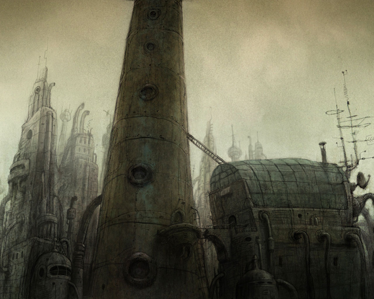
As well as looking at some Bioshock concept art, i also looked into another game called Machinarium, a puzzle point-and-click adventure game developed by Amanita Design,
Machinarium is a strange rusty, metallic place populated only by robots. All the backgrounds throughout the game were hand drawn. The artist, who was right handed, drew most of the backgrounds with his left hand to give it a more sketchy feel. The backgrounds from the game had lots of rusty elements, which i looked at to perfect the look i wanted my buildings in the cityscape to have. Next ill upload some concept art i've done from looking at these two games.
Oh and btw, if you haven't already checked Machinarium out, i suggest you get yourselves a copy, it only costs about a tenner so its not too bad.
Visual Language - Cityscape
So i've decided to go for the cityscape brief, because I haven't done much work on cityscapes and concept art so i thought it would be a nice challenge and something different to do. During my initial brainstorming i was drawn towards the 'Ocean' aspect since i've always loved the vast, deep, open water (thanks to David Attenborough for the wonderful episodes of Planet Earth and Life). Initially I was thinking of doing a cityscape where the buildings were shaped like brightly coloured shells, and coral, as i find they add a lot of beauty to the oceans. Heres an example of a Nautilus inspired house designed by "Senosiain Arquitectos"

After much debate, i decided to go a completely different route. Instead of looking at the beauty of the ocean to inspire my cityscape, I chose to look at the destruction that the ocean can cause. I came up with a background story to accompany my ideas:

Global warming had finally taken its toll on the world
when the polar ice caps melted and flooded 83% of the land.
For fifty years the cities, towns and villages, lay silent
under the ocean, only being disturbed by shoals of
exotic fish swimming down the once bustling streets.
The water finally receded and the cities once again
stood tall in the sunlight, but there was something different.
All of the buildings had the same grim atmosphere, rusted and
layered with dark moss.
With this in mind I went on to research buildings that had the look that I had in my mind. Turns out there was one in particular very close to home. I am, of course, talking about the Broadcasting Place which was designed by "Feilden Clegg Bradley Studios"

"Broadcasting Place"
Although this is the sort of rusty building I had in mind, it still didn't have everything I was looking for, but its definitely a good basis to build on. Check back soon for some more research/concept.
Cheers
Saturday 30 January 2010
Modnation Racers

Ok first of all I have to say what an amazingly epic game this is. For all of you who haven't seen or heard of this game then you should check out the trailer and get your gaming taste buds tingling.
Looks pretty awesome huh? Well it just so happens that on the fateful 21st day of January I was doing a bit of window shopping on the good old PS Store, when i came across the Public Closed Beta of Modnation Racers. I couldn't believe my eyes, it wasn't until later that i found out that i was one of the lucky 100,000 gamers to play this beta version. Enough of me going on, let me tell you a little bit about the game.
To give you a basic idea of what kind of game this is, you could say it was a mix between Mario Kart, (i.e. the driving style, drifting, obstacles, and power-ups/weapons), and Little Big Planet, (i.e. the look, and the games large emphasis on customisation). When i say large emphasis on customisation I mean large. You can create your own karts from scratch, choosing between different engines, bodies, steering wheels, colour, decals, you name it you can probably do it. They even have a toilet seat as a chair. Not only that, but you can fully customise your own mods (your character). You start of with a blank canvas, a "sackboy" looking white model, and you can choose your hairstyles, your ears, your skin colour, different skin designs, clothes, accessories, everything. At the moment there are 315 different mouths to choose from and 260 different eyes. You can even change the material, making it more rubbery or nice and shiny. Amazing stuff really.
Last but not least is the Track Studio. This is where you can create your very own tracks which you can later share online with everyone. You start off by picking a style, the beta version only has Alpine, but there will be a total of 4 in the full game. To lay the track you drive a big asphalt laying truck, your essentially painting the track onto the terrain. Once you've finished laying your track you can then modify the landscape, making mountains or valleys, change the sun height and direction, cloud cover, height of water, and of course you can add houses, trees, animals, jumps, boosts, power-ups, the list goes on...
So yeah, to conclude, you can make your own tracks, characters, and karts. You can play online with up to 12 players from around the world, you can play 4 player split screen, you can upload your creations for others to download, as well as download other peoples creations and remix them to your own taste. (original creator gets some recognition) The release is set for Spring 2010, definitely worth buying, and just to point out its only for PS3, sorry to disappoint all you Xbox 360 fans, just means you'll have to get your hands on a PS3 which you should have done in the first place ;) (just joking :p)
I will upload some pictures of the creations I have made soon, so you can get a taste of what is to come.
Hope you have all enjoyed this, and feel free to leave comments.
Subscribe to:
Posts (Atom)